A Showcase of Rapid Design Sprints Across Diverse Industries
Overview
Brief:
A compilation of user-friendly interfaces deftly navigated design challenges in rapid sprints, swiftly addressing real user issues with quick thinking and quick iteration. Beyond mere visuals, each screen embodies thoughtful user experiences—a testament to the power of practical design sprints.
Scope:
UI/UX, Design Thinking, Journey Mapping, Wireframes, Prototyping, Responsive Design
Sign-in Screen
Redesigning the mobile app's sign-in screen for a user-centric experience. Prioritizing simplicity and quick access, the process involves rapid iteration to refine the design based on user feedback for optimal usability.

Checkout Screen
Prioritizing clarity and efficiency, the design centers on user-centric principles. Quick iteration cycles were employed to fine-tune and optimize the checkout journey. Resulting in a seamless, visually appealing, and conversion-focused redesign, attentively crafted for user satisfaction and aligned with business goals.

User Profile Screens
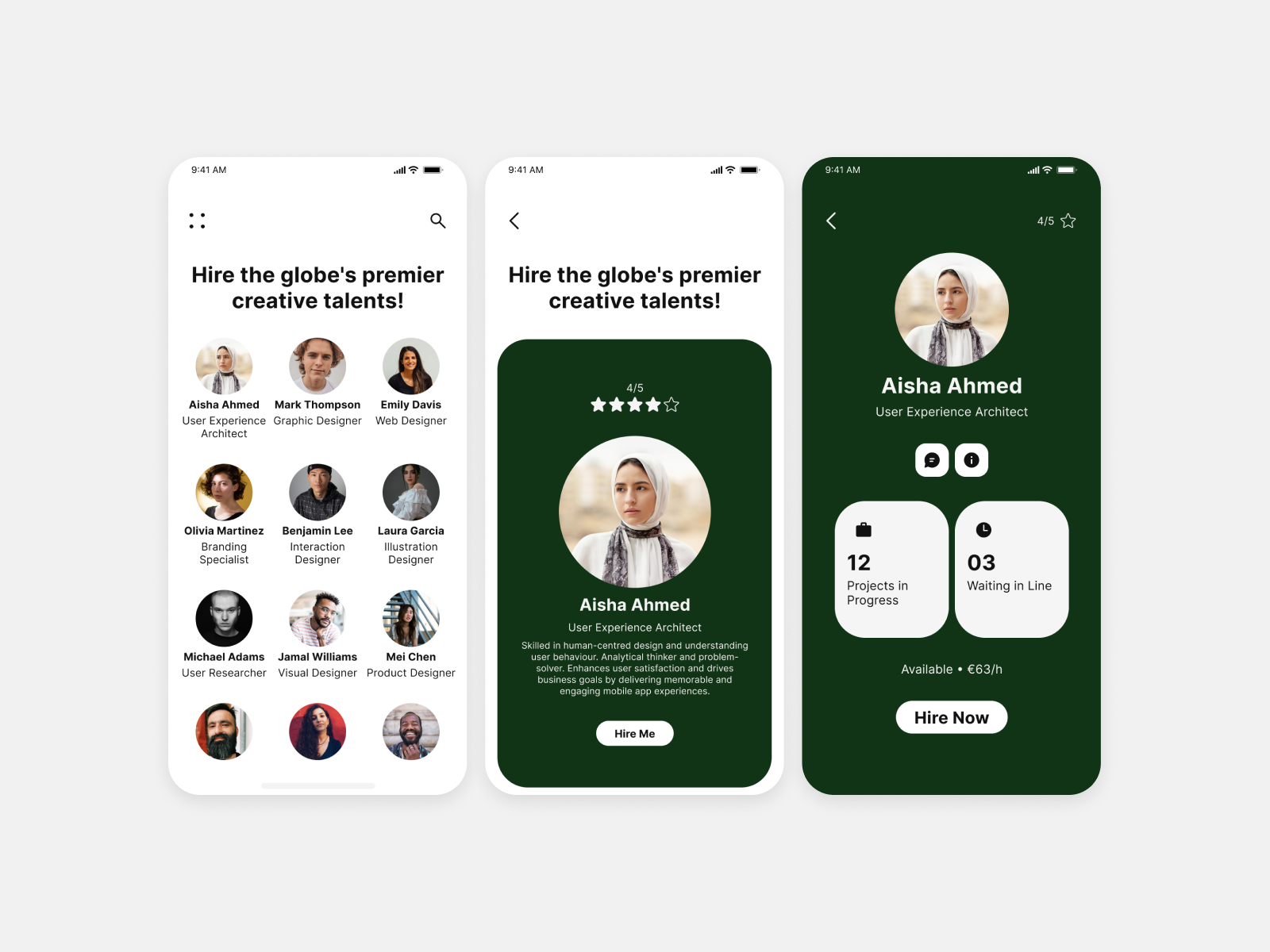
Developing the design of user profiles on a job site social platform involved a deliberate and user-centric process. This encompassed streamlining interactions, optimizing layout elements, and ensuring a smooth transition between different sections for an enhanced user experience.
Settings Screen
Prioritizing clarity and accessibility, the design offers intuitive navigation and a clean layout. Key features include a clear visual hierarchy, customization options, and smooth transitions between sections. Interactive elements enhance user engagement, and accessibility features ensure inclusivity.

404 Error Page
Designing NASA's website “Error Page" involved blending creativity with functionality for a positive user experience. Incorporated space-themed imagery, clear messaging, and interactive elements to guide users seamlessly through unexpected errors. The page features a search function for quick content retrieval and includes educational content to align with NASA's mission of public outreach.

Social Share Screen
The design aimed to reflect the user-centric approach of Apple's design system while incorporating any specific guidelines or components relevant to social sharing within the iOS environment.

Music Player Screen
Drew inspiration from the sleek interface of Spotify while opting for simplicity and a light aesthetic. The focus was on creating an intuitive and uncluttered user experience. Streamlined controls, clear navigation, and minimalistic elements were incorporated to enhance usability. The light interface not only provides a visually calming experience but also complements the music-listening atmosphere.

Calculator Screen
Crafing for mobile, the design features both light and dark interfaces. Emphasizing a clean UI and typeface for clarity and modern aesthetics, the light interface offers a minimalistic and soothing experience, while the dark interface focuses on readability in low-light conditions with a sleek design. The result is a versatile and visually pleasing calculator experience catering to various preferences.

Mobile App Icon
Designing the pharmacy app icon is an artful process, where the capsule shape, adorned with gradient colors, brings a modern and dynamic feel. The carefully curated color palette harmonizes seamlessly with the app's identity, setting a tone that resonates with users. The choice of a capsule icon not only signifies pharmaceutical relevance but also establishes instant recognition.
